
The afforementioned work was pretty much as its title indicated: a small LED set atop a white box, incessantly blinking, displaying the pop singer's twitter feed in visual dots and dashes. Per the museum program, "Transforming the ones and zeroes of contemporary technology into the dots and dashes of Morse code brings the two languages together and indicates how similar the two are..." Clever? Sort of. Interesting? Mmmm...maybe, as a starting point to discussing the history of language and communication. Art? I don't think so.
The rest of the exhibit contained further exploration of "language in its literal and physical forms". Examples:
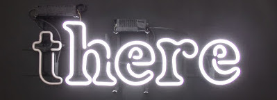
- the word "there" rendered in neon, with the "t" blinking on and off, so it read as "there...here...there...here..." and so on. If you think it sounds like something you might find in a tacky gift shop, you would be wrong, because it's in an art museum, so it must be art.
- an image on one of those ridged surfaces that changes depending on the angle at which you observe it, like you might find on an old postcard. As you walk by it, you see the words "right", then "write", and then "rite". Gosh, they all sound the same but have different meanings! *scratches head*
- a huge ">" suspended from the ceiling. You know, a "greater than" sign. No, wait, from the other side, it's a "less than" sign! Freaky. What am I supposed to think? The program says that Swanson is playing "with a duality within our linguistic system such that one thing can refer to its very opposite, and how an alternate reading of this work is entirely dependent upon the placement of the viewer." Glad they cleared that up.
There was more, but you probably get the idea. It's conceptual. Unfortunately, the concepts themselves are pretty banal. That's one of those words I hear often, but for which I could not have given a precise definition..so here it is: so lacking in originality as to be obvious and boring.
So...no evidence of craft, no beauty, no visceral punch, all backed by somewhat catchy, but ultimately pretty simple ideas. Sort of like marginally clever t-shirt designs. Except that it's all in an art museum, and it was designed by an artist. Get it? The defining characteristic of the work is not the work itself, but who did it and where it's displayed. It is, as the legitimately clever
 has termed it, "contextual". It is entirely ordinary and not at all noteworthy outside of its context.
 That being said, I do enjoy my visits to the MCA, because they make me think, and to look at things in new ways. So maybe they are onto something...